AI-Enhanced Flow Cytometry: Master Beautiful Data Visualization with R and AI


– 3 chapters: exclusive access for VIP members; easier for those who have already completed our first course, which produced quick and stunning results!
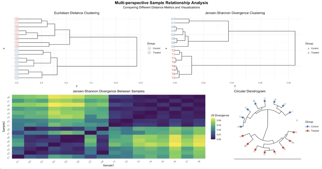
This Jensen Shannon divergence plot is just a taste of what’s possible – imagine creating 10 different eye-catching visualizations that make your data sing!


Chapter 1:
In this first chapter, you’ll discover how to instantly convert your FCS files into organized dataframes, setting the foundation for seamless integration with AI-powered visualization tools. 🚀 With this powerful combination of automation and AI-assisted visualization, you’ll unlock the ability to generate sophisticated, publication-ready graphs with just one click, revolutionizing how you explore and present your cytometry data! ✨
Chapter 2:
🚀 Step into the exciting world of AI-powered cytometry analysis as we combine the intelligence of Claude with the visualization power of R to create your first custom graphs! 🎨 This hands-on chapter will guide you through every step of the process, showing you how this magical combination can transform your data into beautiful, meaningful visualizations – a skill that will revolutionize how you analyze and present your cytometry results. ✨
Chapter 3:
🎨 Dive deep into advanced cytometry visualization as we combine R’s powerful graphics with Claude’s intelligence to craft beautiful, publication-ready figures! ✨ From heatmaps to Jensen Shannon analyses, discover how to transform your data into stunning multi-perspective visualizations that will make your scientific story shine! 🌟
